


Transforming Data Visualization into Data Storytelling: The S-DIKW Framework
The Problem with Traditional Data Visualization
As Cairo (2016) highlights, effective data visualization requires a balance between function and aesthetics to communicate meaning. However, standard data visualizations often fail to engage audiences emotionally and cognitively, making it difficult for them to interpret complex datasets meaningfully.
Standard data visualizations effectively summarize and present complex datasets, but they often lack a narrative structure that makes the information actionable and memorable. Without context, relationships, or interpretation, audiences may struggle to understand the significance of the presented data.
For example, a bar chart showing rising global temperatures over decades is informative but does not necessarily inspire action. Adding context, human elements, and narrative flow can significantly improve engagement and retention.
Implementing the S-DIKW Framework in Practice
The S-DIKW Framework expands upon the DIKW Pyramid by incorporating storytelling elements at every data transformation stage (McDowell, 2021).
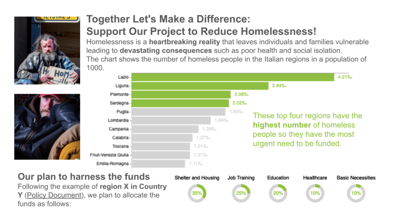
To demonstrate how this framework can be applied in real-world scenarios, we explore a case study focused on homelessness in Italy. The dataset provides insights into the distribution of homelessness across different regions, highlighting disparities that require targeted intervention. Using this data, we can craft a compelling narrative that presents statistics and drives understanding and action. To illustrate its practical application, we analyze the homelessness crisis in Italy, applying each stage of the framework to create an effective data story.
S-Data: Identifying and Representing Key Insights
S-Data represents the foundational stage of data storytelling, where raw data is selected, cleaned, and visualized to highlight key insights. At this stage, the goal is to present information clearly and structured, ensuring that data is accurate and accessible. The choice of visualization depends on the nature of the data and the story it needs to tell. By selecting the most relevant and impactful data points, we lay the groundwork for a compelling narrative.
For the homelessness crisis in Italy, we begin by selecting data that highlights the top four regions with the highest homelessness rates. A bar chart is chosen as the primary visualization to clarify the disparities, providing an easy-to-interpret comparison. This chart shows which regions require urgent intervention and sets the stage for deeper analysis in the next steps.
S-Information: Providing Context
McDowell and Turk (2024) emphasize that data storytelling is most effective when context is provided to connect raw data with audience understanding. S-Information involves enriching raw data with context to make it more understandable and meaningful. Additional textual and graphical elements, such as annotations, commentary, symbols, and images, are incorporated to provide context. These elements help audiences grasp the data’s significance by explaining why it matters and how it connects to broader trends.
For the homelessness dataset, the visualization is enhanced with annotations identifying the most affected regions, ensuring clarity. Additional commentary explains the socio-economic factors contributing to homelessness, such as rising housing costs or unemployment rates. To humanize the issue, images of affected individuals are included, reinforcing the emotional and social impact of the crisis. This added context transforms a simple data visualization into a more engaging and informative story.
Once the data is selected, adding context ensures the audience fully grasps its significance. This includes textual descriptions explaining what the data represents, annotations highlighting key points, and symbols or images reinforcing the emotional and contextual aspects of the data.
S-Knowledge: Defining the Plot & Resolution
S-Knowledge organizes data and context into a structured narrative that guides the audience through a logical progression. This stage frames the conflict and resolution within the data story. Effective storytelling relies on a well-defined problem statement, evidence-based trends, and proposed solutions that lead the audience toward actionable insights.
In the case of homelessness in Italy, the data story is framed as a pressing issue requiring intervention. The visualization highlights statistical trends, showing increased homelessness rates in certain regions. The story then moves toward solutions, explaining how funding can be allocated to mitigate the issue. A breakdown of proposed actions, such as shelter investment, mental health programs, and job training, provides a clear roadmap for decision-makers. This structured approach ensures that the data story is both compelling and actionable.
By structuring the data story in this way, it transitions from mere statistics to an actionable narrative. The audience is guided through the problem, its consequences, and the steps necessary to mitigate its effects.
S-Wisdom: Tailoring the Story for the Audience
Dykes (2019) underscores the importance of tailoring a data story to its audience, ensuring that key insights are presented in an engaging and actionable manner. S-Wisdom ensures that the data story resonates with its intended audience. Tailoring the message, language, and level of detail, storytellers can make the information more relevant and impactful. Different audiences require different levels of depth. Executives may need high-level summaries, while researchers require comprehensive data breakdowns.
The homelessness story has been adapted to appeal to executives at funding organizations. The title emphasizes funding priorities, while the visualization presents evidence-backed justifications for resource allocation. Calls to action, such as donation links, policy advocacy, and volunteer opportunities, are integrated to drive tangible action. The final presentation is crafted in a way that speaks directly to the priorities and decision-making frameworks of the audience, ensuring maximum engagement and impact.
Figure 1 shows the resulting data-driven story.
The Impact of Data Storytelling
By structuring data storytelling using the S-DIKW Framework, we achieve greater audience engagement, better comprehension, and actionable insights. A well-told story captivates attention, while contextualized data makes information more digestible. Ultimately, data alone does not drive action, stories do.
While data storytelling is powerful, challenges remain. It is essential to balance emotion with objectivity, ensuring that stories remain data-driven while engaging emotions (Lo Duca, 2025). Oversimplification should be avoided, as it can distort meaning. Additionally, data ethics must be prioritized to maintain integrity and avoid misrepresentation.
Conclusion
The S-DIKW Framework bridges the gap between data visualization and effective communication. It enables data professionals to craft compelling stories that drive understanding and action. By carefully structuring characters, plot, and audience engagement, this framework turns raw data into a powerful tool for change.
A further analysis step is integrating the S-DIKW framework and Artificial Intelligence, which could pave the way towards new perspectives and scenarios (Lo Duca, 2024).
References
Cairo, A. (2016). The truthful art: Data, charts, and maps for communication. New Riders.
Dykes, B. (2019). Effective data storytelling: How to drive change with data, narrative, and visuals. Wiley.
Lo Duca, A. (2024). Data Storytelling with Altair and AI. Manning Publications.
Lo Duca, A. (2025). Become a Great Data Storyteller: Learn how you can drive change with data. John Wiley & Sons.
Lo Duca, A. and McDowell, K. (2024). Using the S-DIKW Framework to Transform Data Visualization into Data Storytelling. The Journal of the Association for Information Science and Technology (JASIST). DOI 10.1002/asi.24973
McDowell, K. (2021). Storytelling wisdom: Story, information, and DIKW. Journal of the Association for Information Science and Technology, 72(10), 1223-1233.
McDowell, K., & Turk, A. (2024). Data storytelling and audience engagement: A narrative approach to information science. MIT Press.. The truthful art: Data, charts, and maps for communication. New Riders.
